The Crown Jewel Of Reliance

The Crown Jewel Of Reliance

Brand Identity & Visual Extension for Vantara

Fostering Education With Zipply

Fostering Education With Zipply

Brand Identity & UI For Zipply Platform

Smart Co-Working With 1Excel

Smart Co-Working With 1Excel

Identity & Visual Extension For Co-Working Space

IDENTITY CONCEPT

A name rooted in nature. Refined through design.

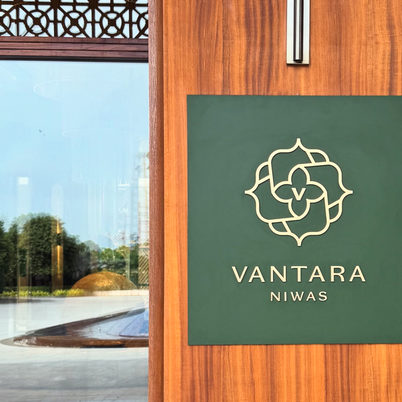
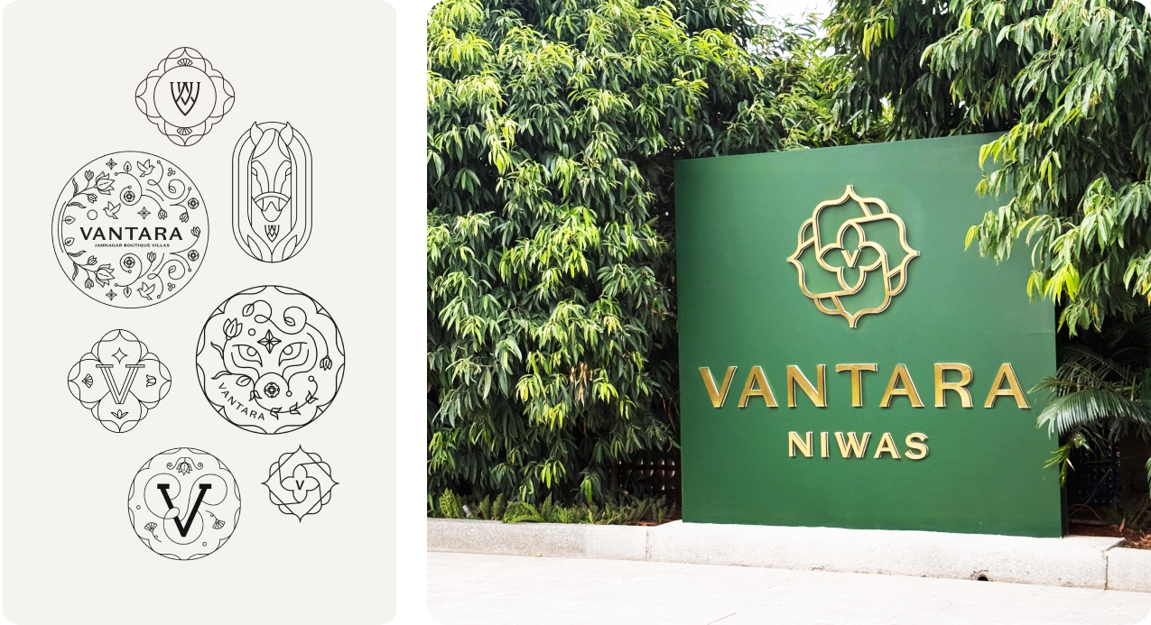
Vantara Niwas, draws from the township’s wildlife conservation centre, Vantara, meaning “Star of the Forest.” It reflects a larger vision where luxury, sustainability, and the natural world exist in harmony.

The word mark combines classic serif typography with clean lines and contemporary refinement. Elegant proportions and carefully considered details create an identity that feels timeless, confident, and effortlessly luxurious.
We built very strong values & principles to make sure the Sabo experience is translated properly.

How should heritage be experienced, not just preserved?

SABO believes & treats heritage as inheritance rather than admire from a distance.

The bhawan’s history is preserved through its materials, architecture, space, and the everyday rituals, allowing the past and present to exist naturally together. Every experience feels authentic & quitely timeless.

How should heritage be experienced, not just preserved?

SABO believes & treats heritage as inheritance rather than admire from a distance.

The bhawan’s history is preserved through its materials, architecture, space, and the everyday rituals, allowing the past and present to exist naturally together. Every experience feels authentic & quitely timeless.

How should heritage be experienced, not just preserved?

SABO believes & treats heritage as inheritance rather than admire from a distance.

The bhawan’s history is preserved through its materials, architecture, space, and the everyday rituals, allowing the past and present to exist naturally together. Every experience feels authentic & quitely timeless.

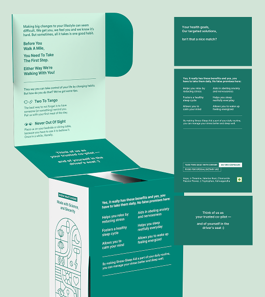
Starting is the hardest part, so we designed the box to do some of the coaching.

A new health routine is overwhelming, and most people quit before the first box is finished. So we built the coaching into the packaging instead of leaving it to the label.

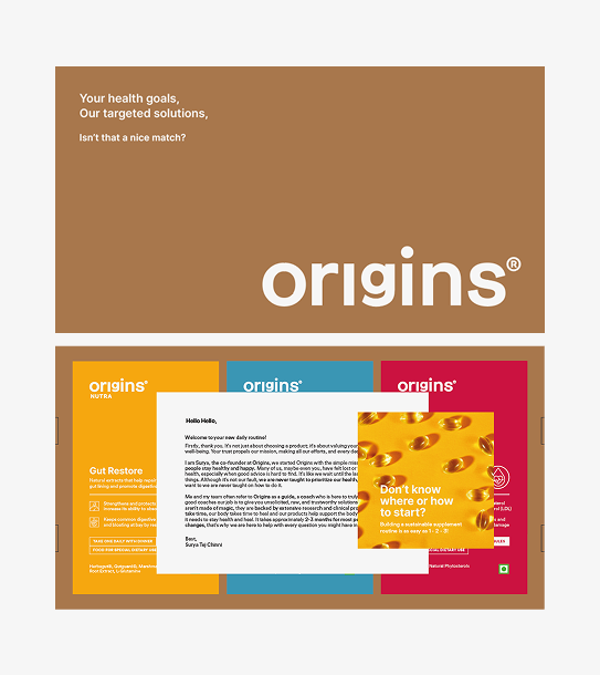
The products arrive in a brown corrugated box that opens to a founder’s note and a short brochure on how to begin. Both set expectations before the first capsule.

Habit formation is what makes the difference. Why consistency matters, what makes it easier, and clearly stated benefits so you know what to expect and roughly when.

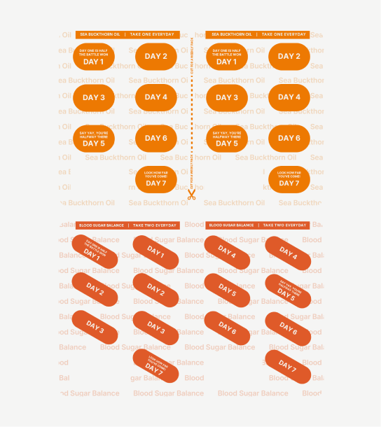
The pill strip stays with the consumer longer than anything else. Divided by day, with an affirmation on each, colour coded and named so the right strip is findable without reading it twice.