
The Crown Jewel Of Reliance

The Crown Jewel Of Reliance

Brand Identity & Visual Extension for Vantara

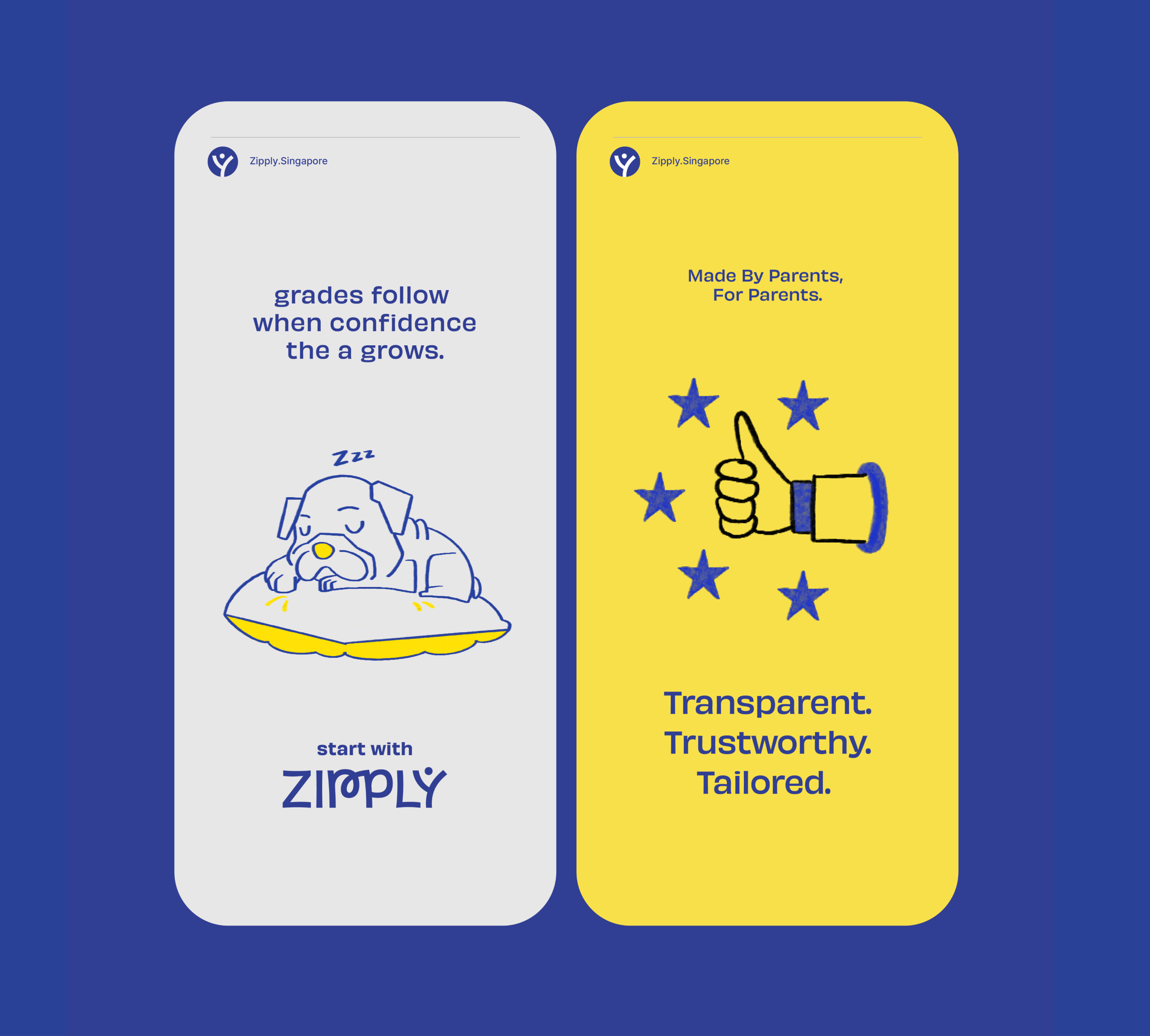
Fostering Education With Zipply

Fostering Education With Zipply

Brand Identity & UI For Zipply Platform

Smart Co-Working With 1Excel

Smart Co-Working With 1Excel

Identity & Visual Extension For Co-Working Space

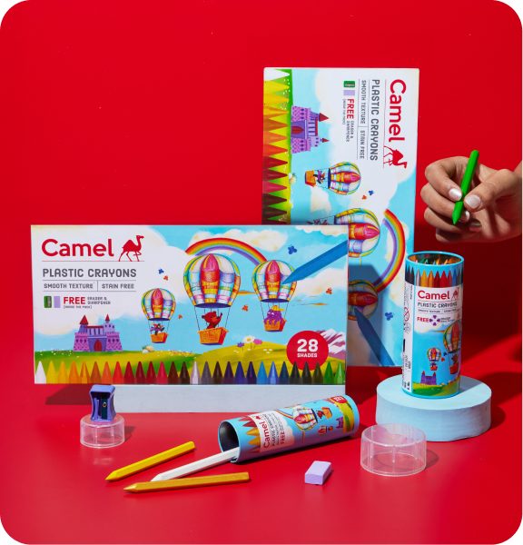
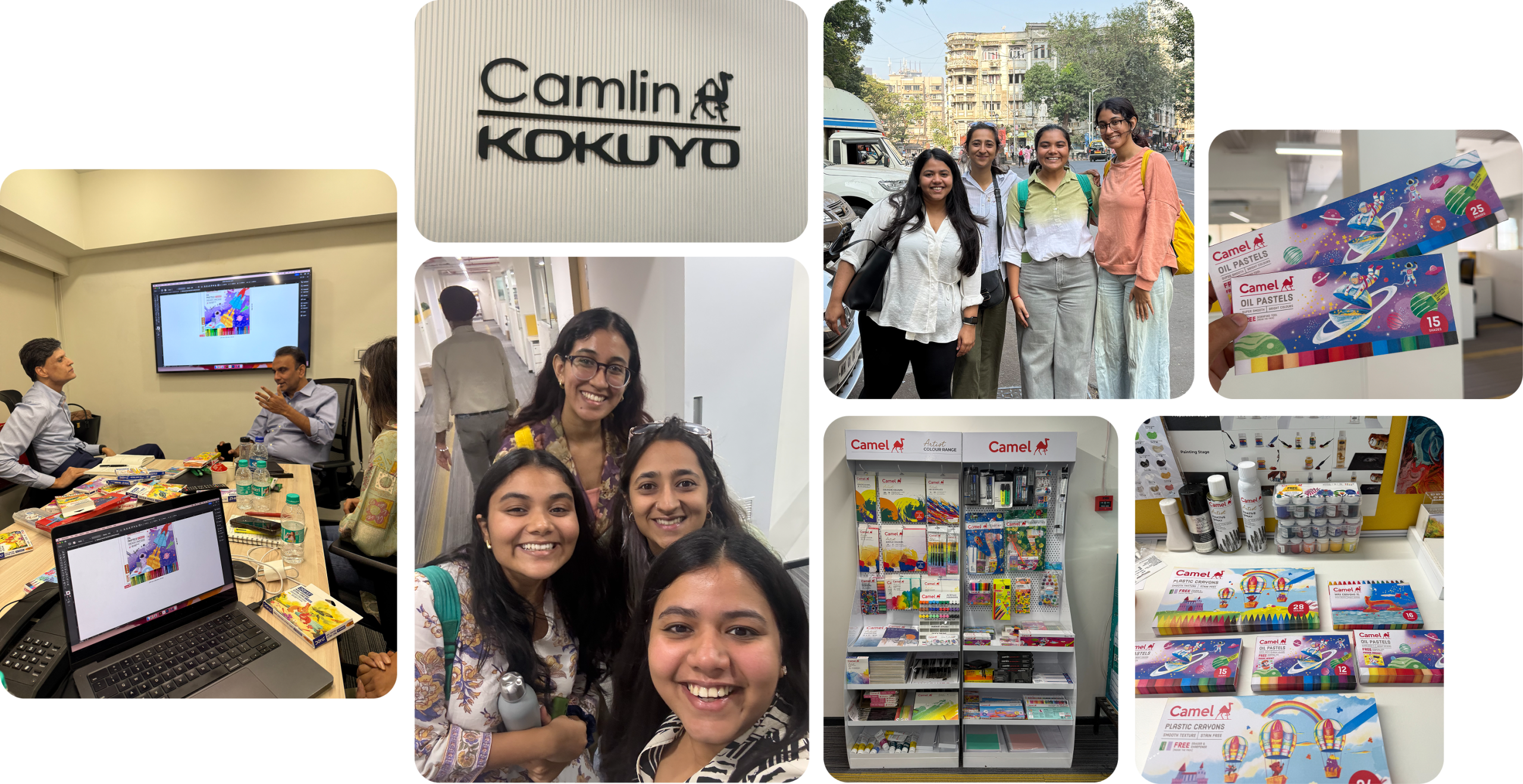
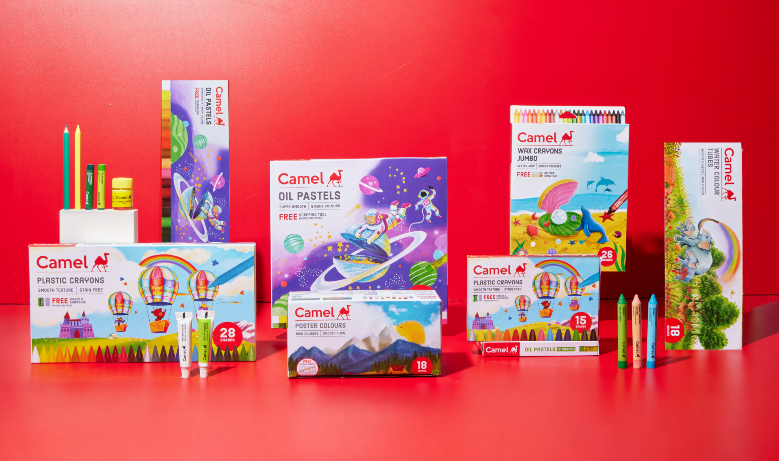
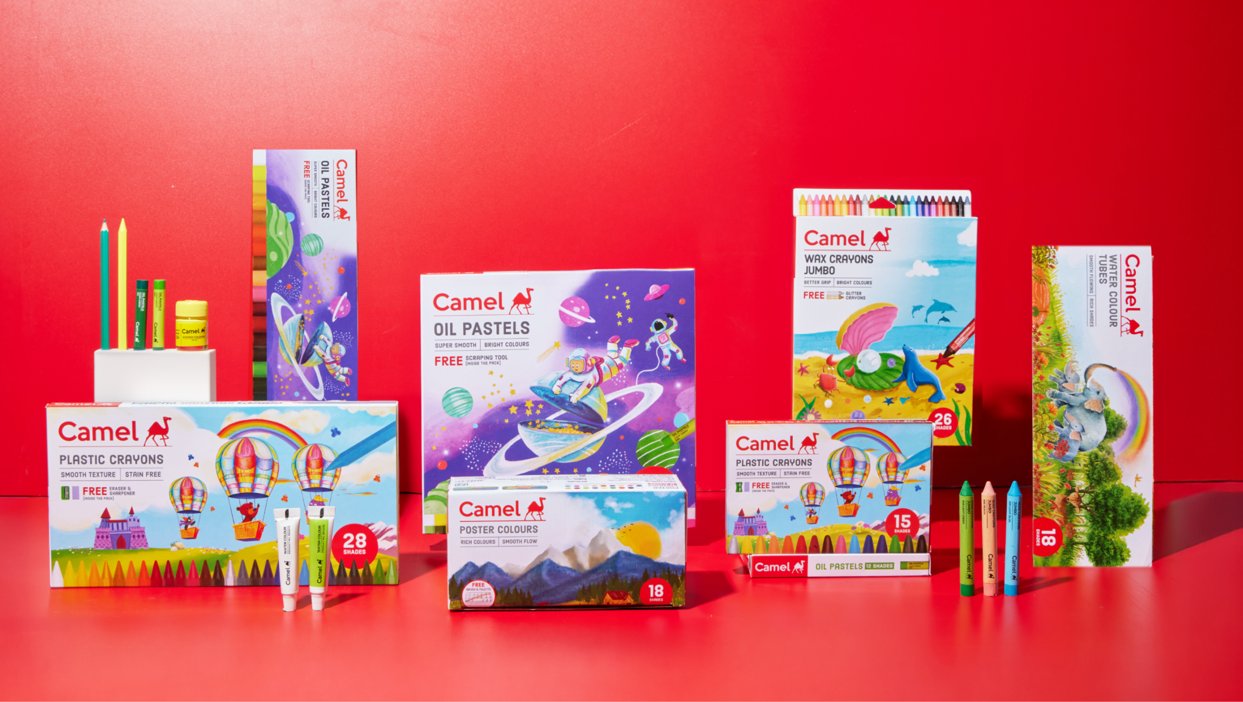
Inside A Child’s Mind With Camlin

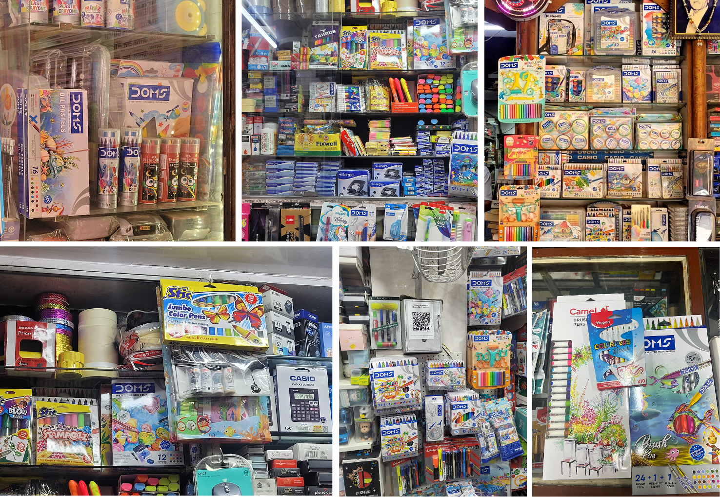
What makes a child pick a certain crayon pack vs the other?

Scope Of Work: Market Research, Brand Strategy, Consumer Understanding & Psychology, Product Packaging.

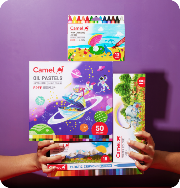
Kokuyo Camlin is a legacy brand that has defined what stationery means to multiple generations of Indians. Everyone has some memory or association with it. So when Kokuyo Camlin’s CMO, Rishi Kakar, reached out, it was a dream come true for CC.

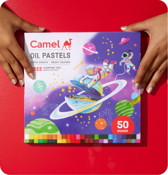
This time the brief was a very simple, change the kid’s crayon packaging. But only if the answer was that as simple as the ask.

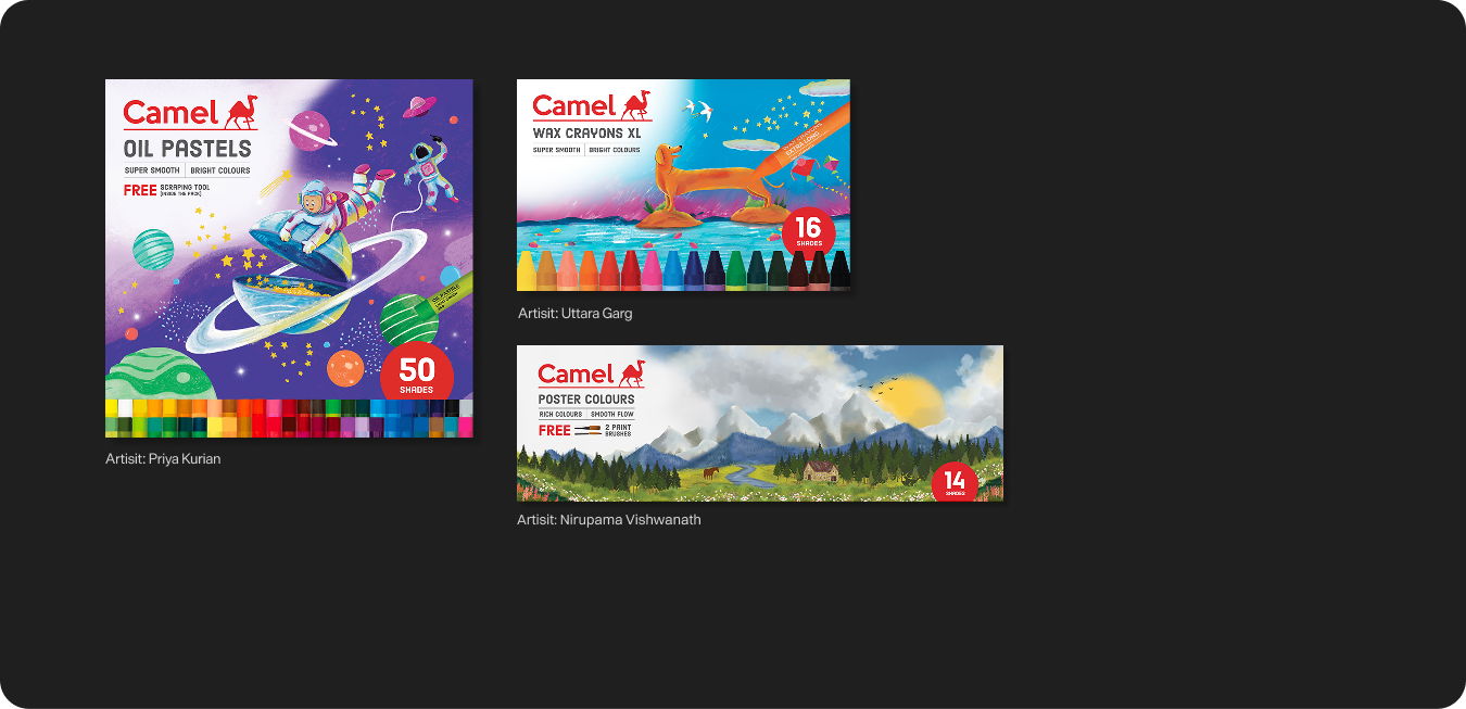
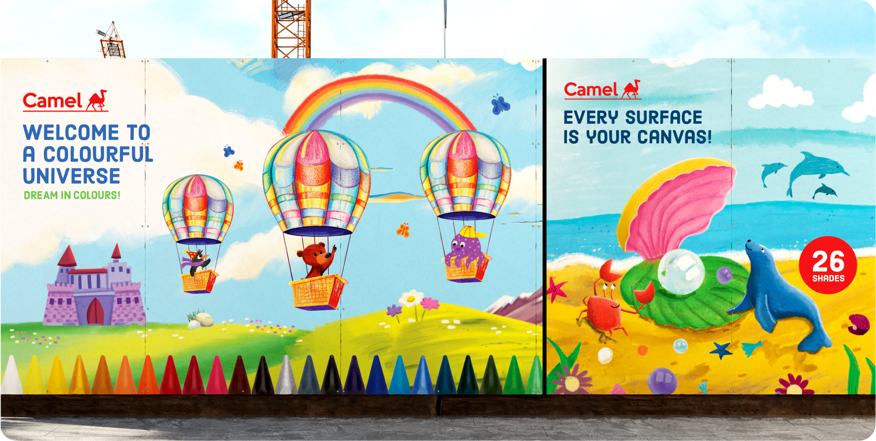
The project demanded extensive consumer study to understand why a child chooses a particular product, and what truly drives that decision. Almost a year later, that insight-led journey resulted in a completely refreshed packaging range for the entire kids’ portfolio of Camel.

SKIP TO THE VISUALS
The Crown Jewel Of Reliance

How do you create a 
luxury destination 
with a local soul?

Scope Of Work: Brand Strategy, Brand Identity, Visual Language, Product Packaging & Signage Design.

Do all luxury hotels often promise the same things? Heritage, Detailing, Elegance, Exceptional service? If every hotel destination looks luxurious, what truly gives it a sense of place?


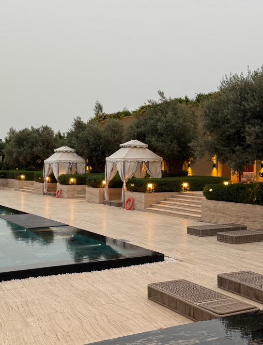
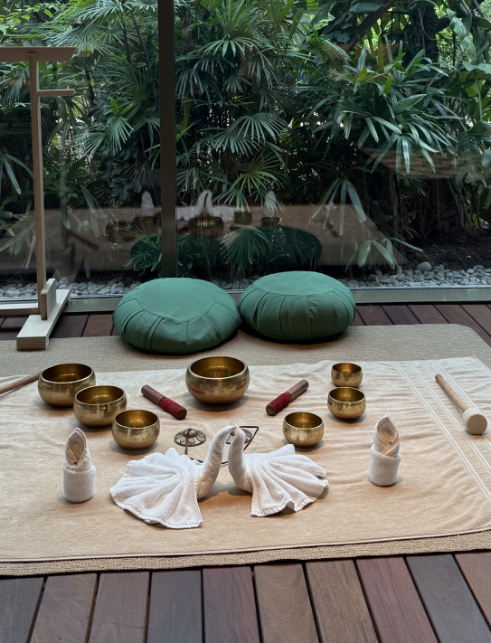
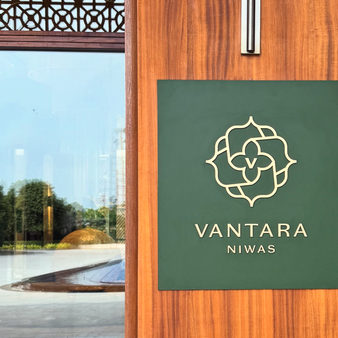
We explored this question with the team behind Vantara Niwas. Inspired by the Saurashtra’s architecture, cultural richness and craftsmanship. The opportunity was to create a brand in hospitality that felt deeply connected to its surroundings.


The goal was to build an identity rooted in context rather than convention. We started by studying the region’s history and visual language to create a luxury experience that truly belongs and does justice to its place.
IDENTITY CONCEPT

A name rooted 
in nature. Refined 
through design.
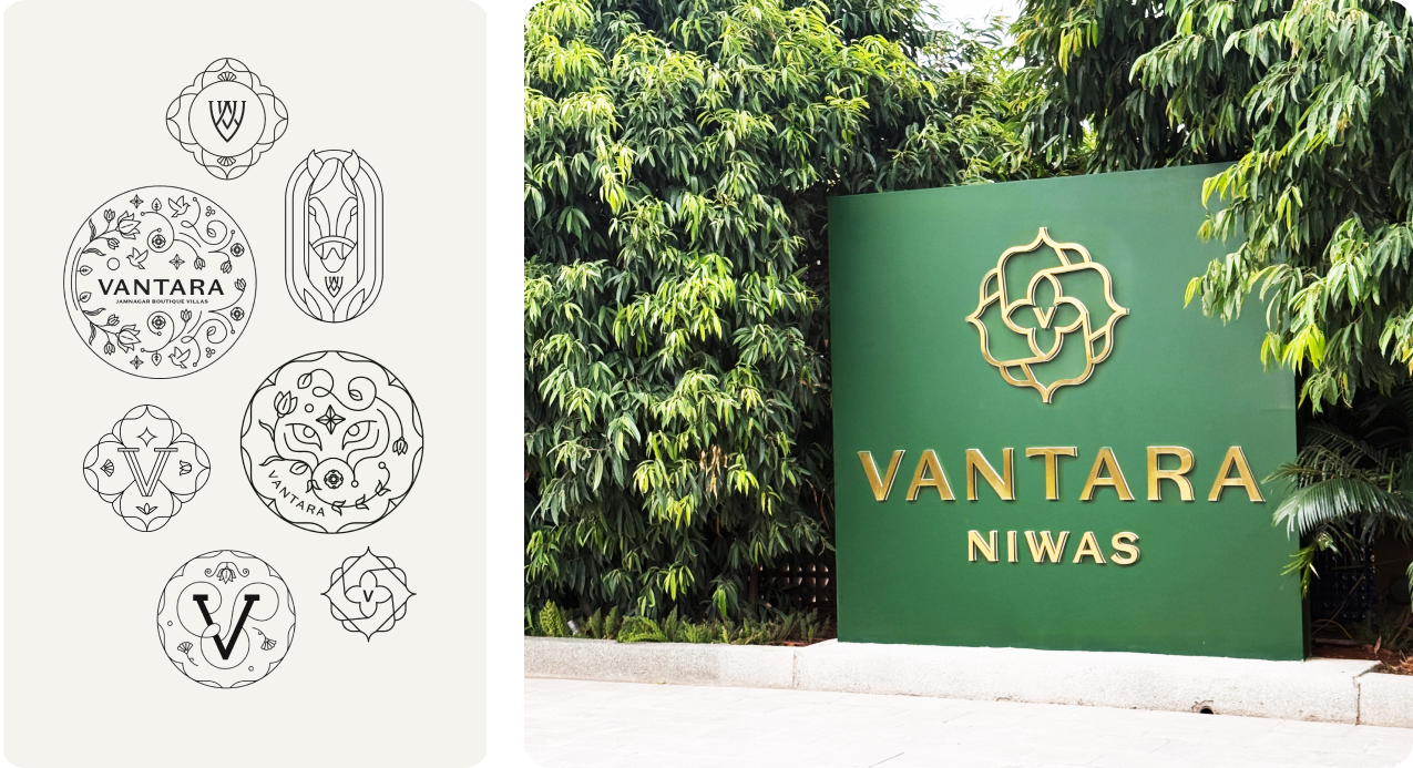
Vantara Niwas, draws from the township’s wildlife conservation centre, Vantara, meaning “Star of the Forest.” It reflects a larger vision where luxury, sustainability, and the natural world exist in harmony.
The word mark combines classic serif typography with clean lines and contemporary refinement. Elegant proportions and carefully considered details create an identity that feels timeless, confident, and effortlessly luxurious.

Smart Co-Working With 1Excel

A Postcard From Bharat

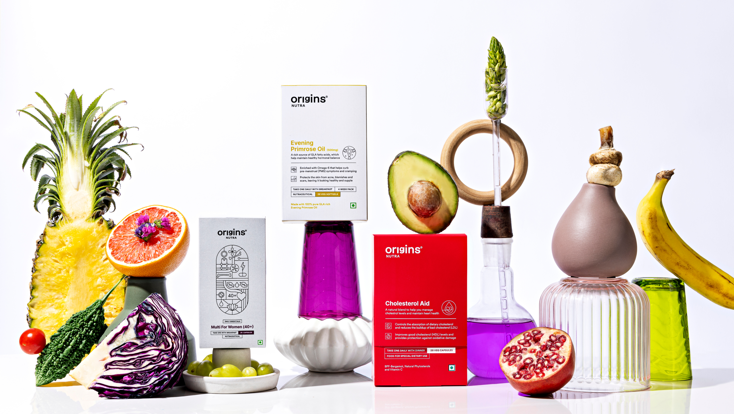
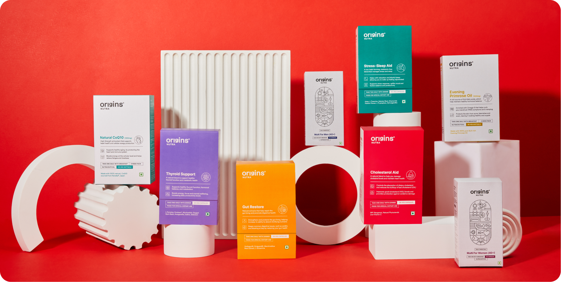
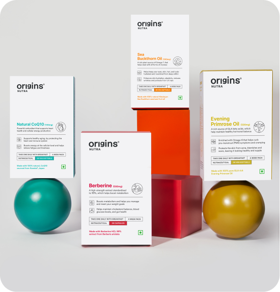
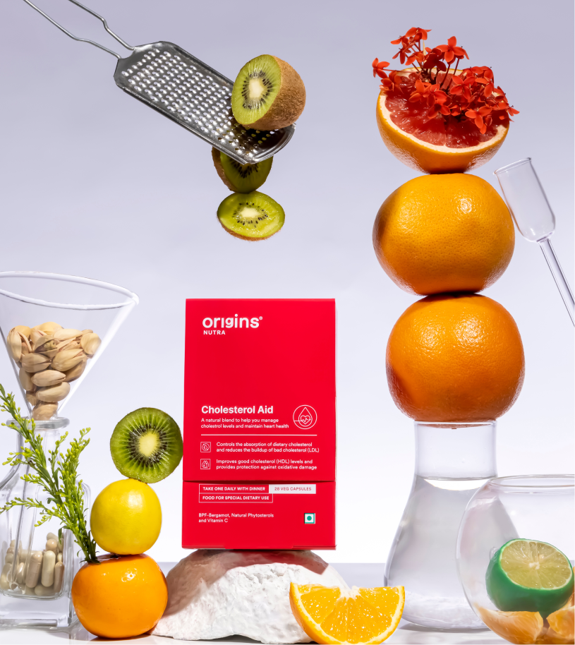
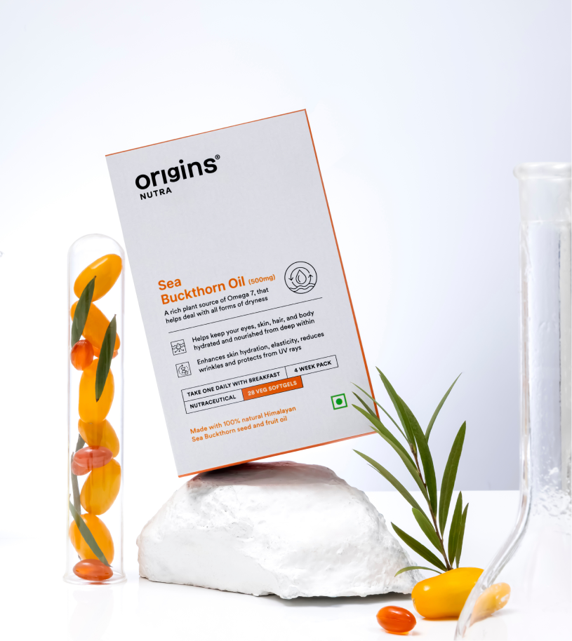
Origins, It Starts With You

Can health be made simple enough to become a habit?

Scope Of Work: Market Research, Brand Strategy, Consumer Understanding & Psychology, Brand Identity, Product Packaging and Web Design.

Is it just us, or does every supplement feel like a gimmick? Every nutraceutical brand says the same three things. Good for you. Clinically proven. Backed by science. So was Origins different?

We went at it from the other side with Surya. If supplements are meant to be preventive rather than curative, can they actually deliver on that? And what would a brand look like if it took the question seriously?

The goal was to build something easy, functional, and truly habit forming. Health, as simplified as we can follow. We started questioning everything to build the origin of brand Origins.

SKIP TO THE VISUALS

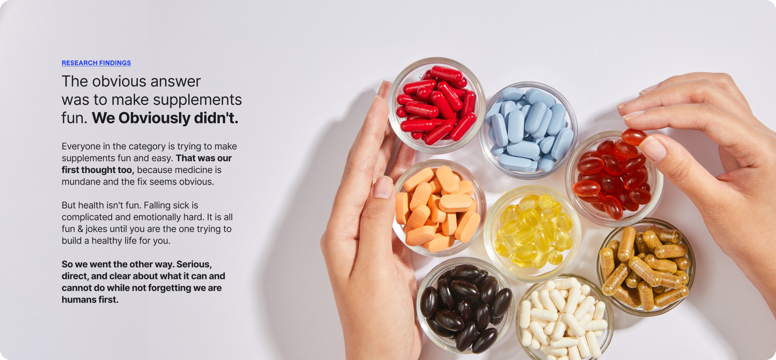
RESEARCH FINDINGS

A category full of claims and empty of trust.

We spoke to people about their relationship with health and how they actually live with it. What they take, what they’ve quit, who they ask before buying anything.

Given the age we’re in, the findings surprised us. Information is everywhere and almost none of it is verifiable. There’s no source anyone genuinely trusts. Somewhere in all of that, people stopped believing any of it.

People think falling sick after a certain age is quite normal.

The belief in medicines and not supplements is the main problem. Treat something ONLY if required and not add anything extra.

No one wants to add
anything extra to the body.

It’s overwhelming and people don’t know how and where to start.

People are doctor dependent and are scared to make a decision on their own. They feel they will do more damage than improving it.

So they avoid it, until they really have to.

It seems gimmicky. No trust in the new age brands.

People don’t believe supplements are effective. They don’t trust the new brands so they hesitate in taking the first step.

All brands have the same claim. Who do you believe? and who do you not?

THE BEST PART

What if it stopped being a supplement brand?

Everyone is chasing a health goal. Eating better, moving more, losing weight. Nobody finds it easy. It’s complicated, and intimidating enough that most people give up in the first month.

Origins stopped being a supplement brand and became a coach. Not a cheerleader. The kind of coach who tells you what you need to hear, gives advice you didn’t ask for, and stays with you through the boring middle part.

Simple. Reliable. Built For Better Health & Everyday Life.

Why do we exist today? Why are we really doing this?

People are unaware of what goes inside their food and are surrounded my incorrect facts or half truths about supplements.

We wanted to simplify things but not compromise. We want to do it right, for you.

How are we doing this? How are we making a difference?

By questioning everything we do. From the need, to the product form, to the manufacturing process, the ingredients and the end product.

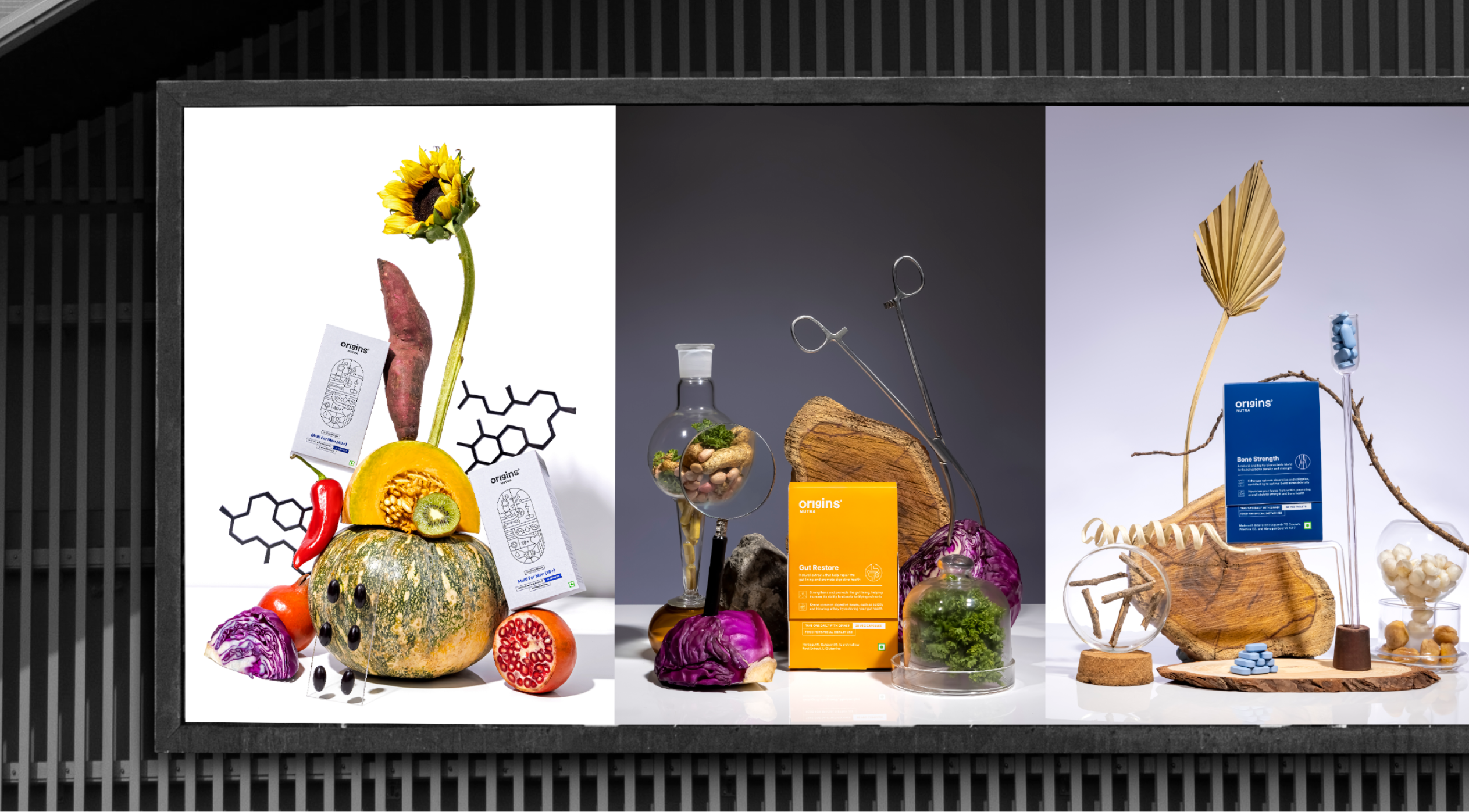
Our products are the mix of nature (herbs, minerals, plants, flowers) and modern nutritional science.

What are we doing? What is so different about us?

We are a natural, clinically proven and researched supplements brand specialising in efficient healthcare, backed by science.

We are making healthcare simple so that you understand why and what you are getting into.

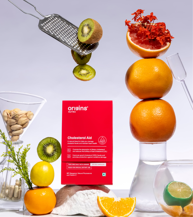
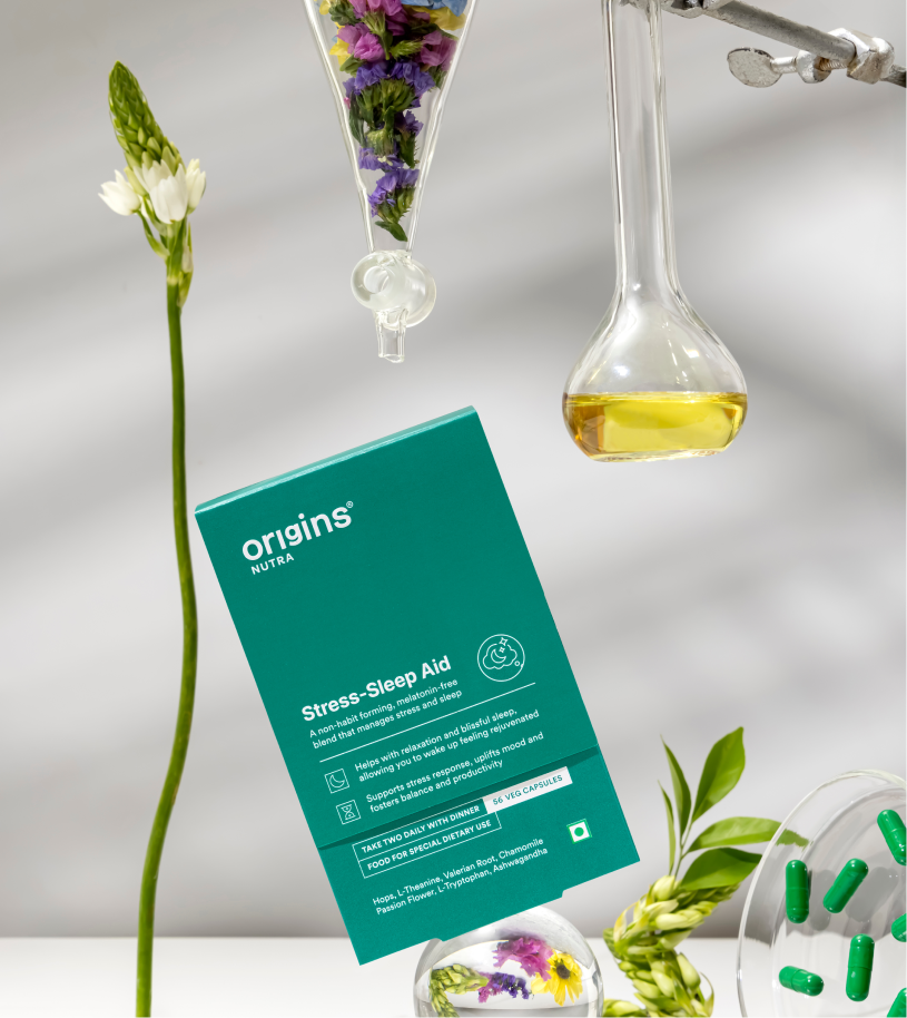
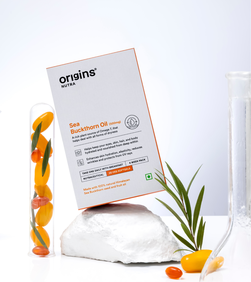
We addressed the most asked: What is really inside?

We built the entire brand on the basis on what’s inside the pill since everyone is skeptical about adding anything extra.

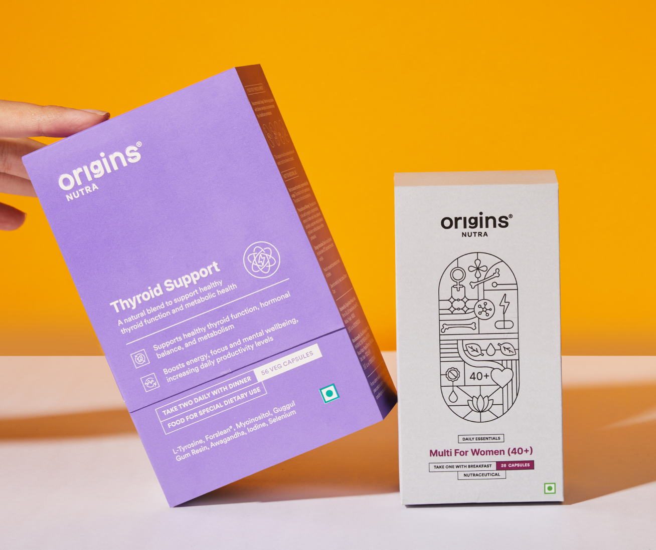
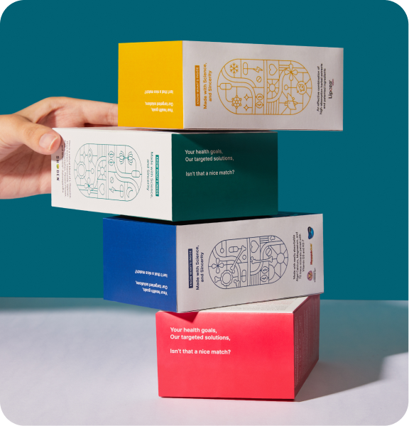
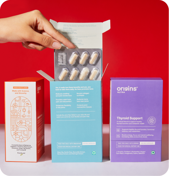
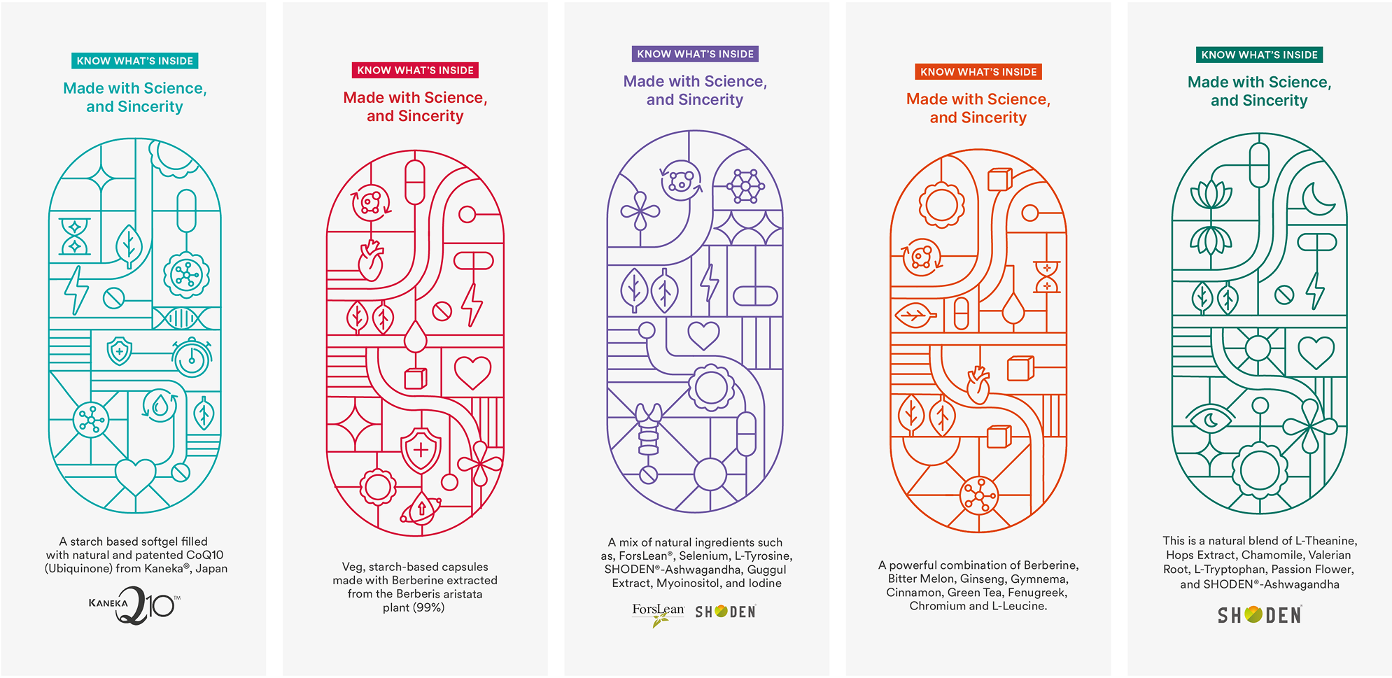
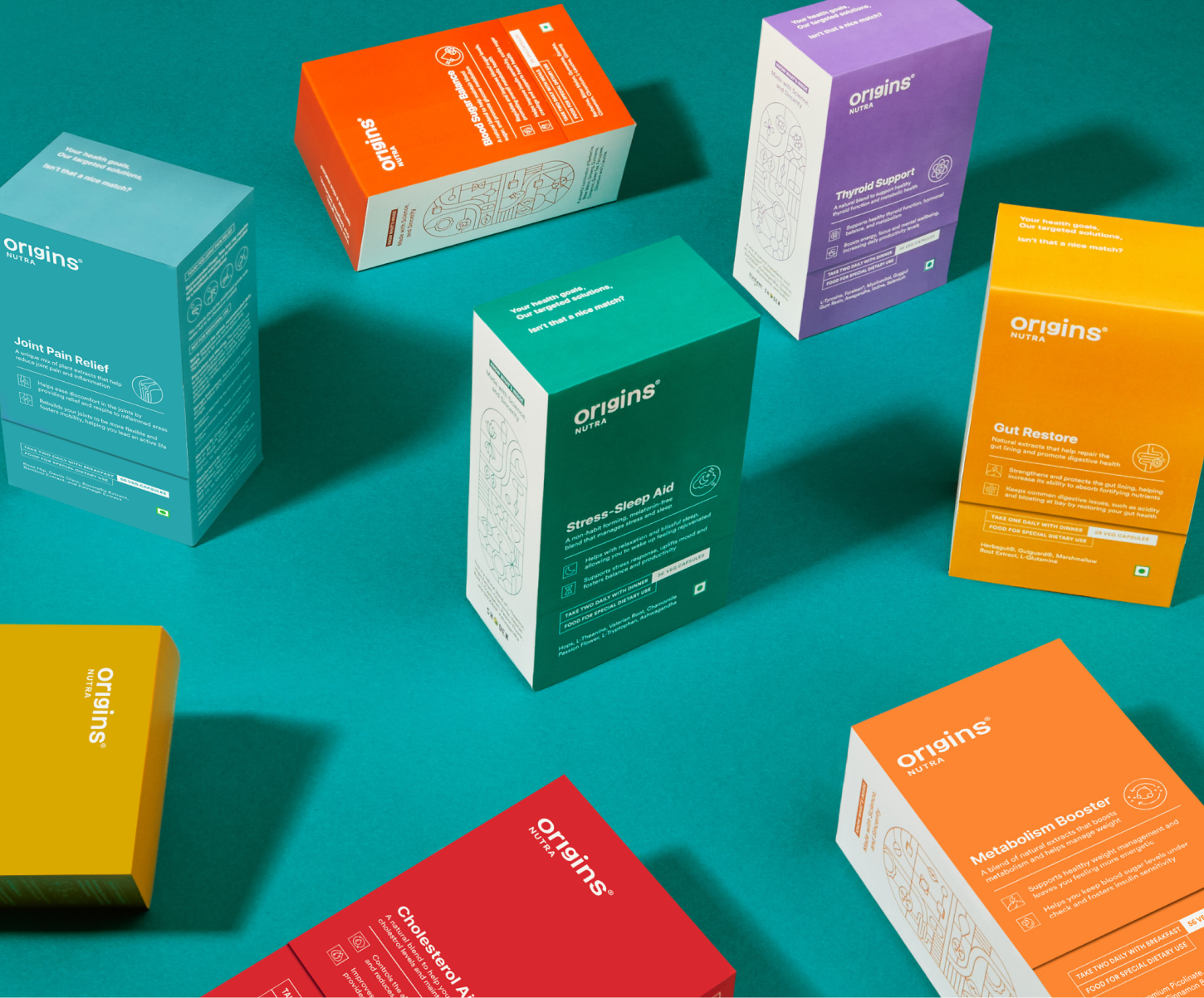
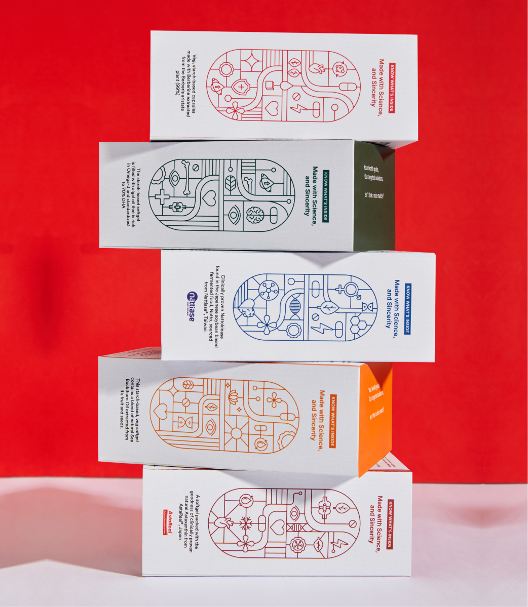
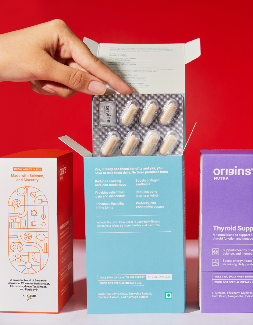
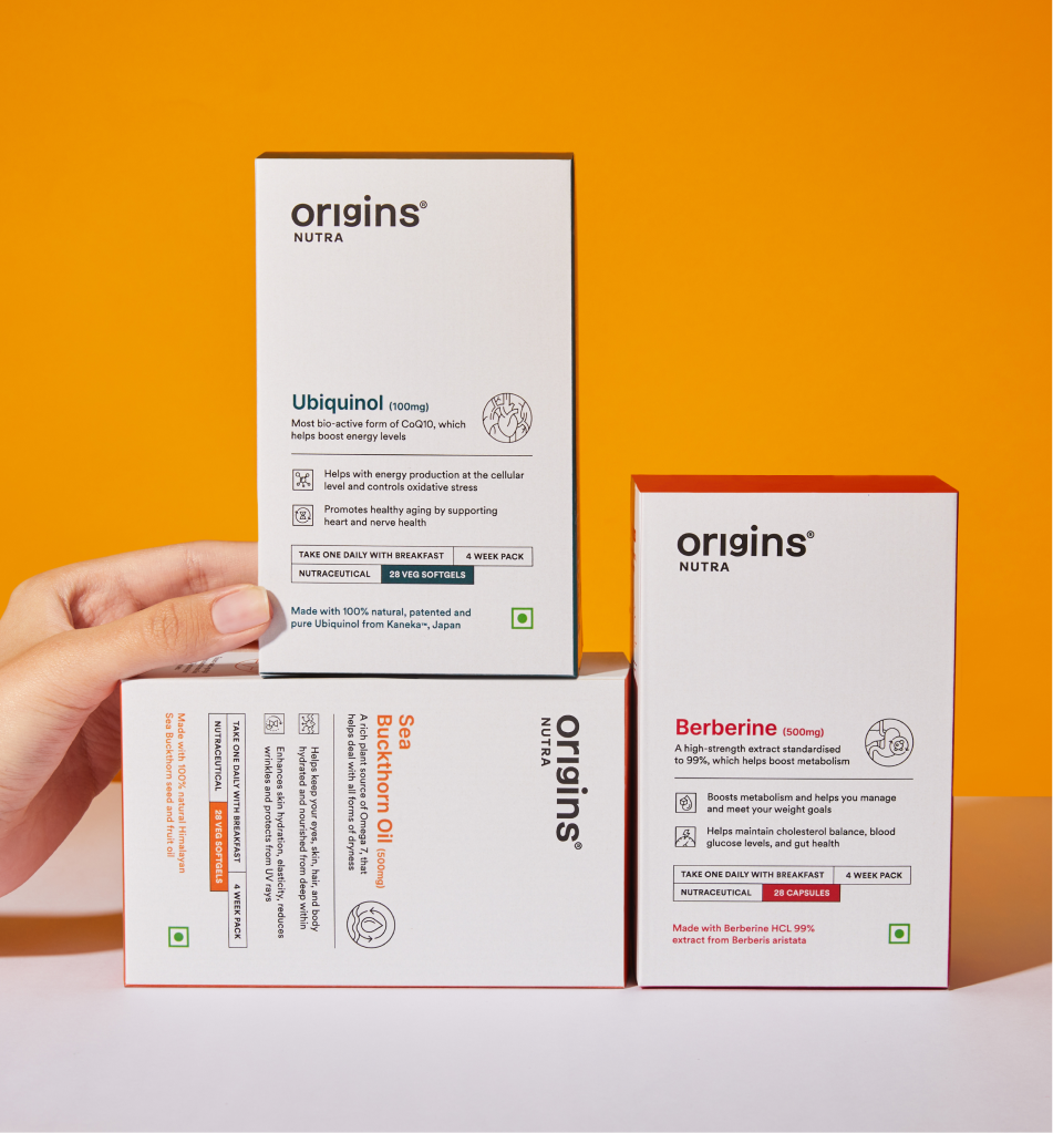
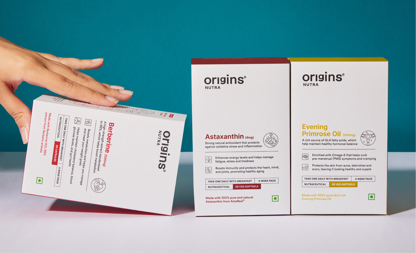
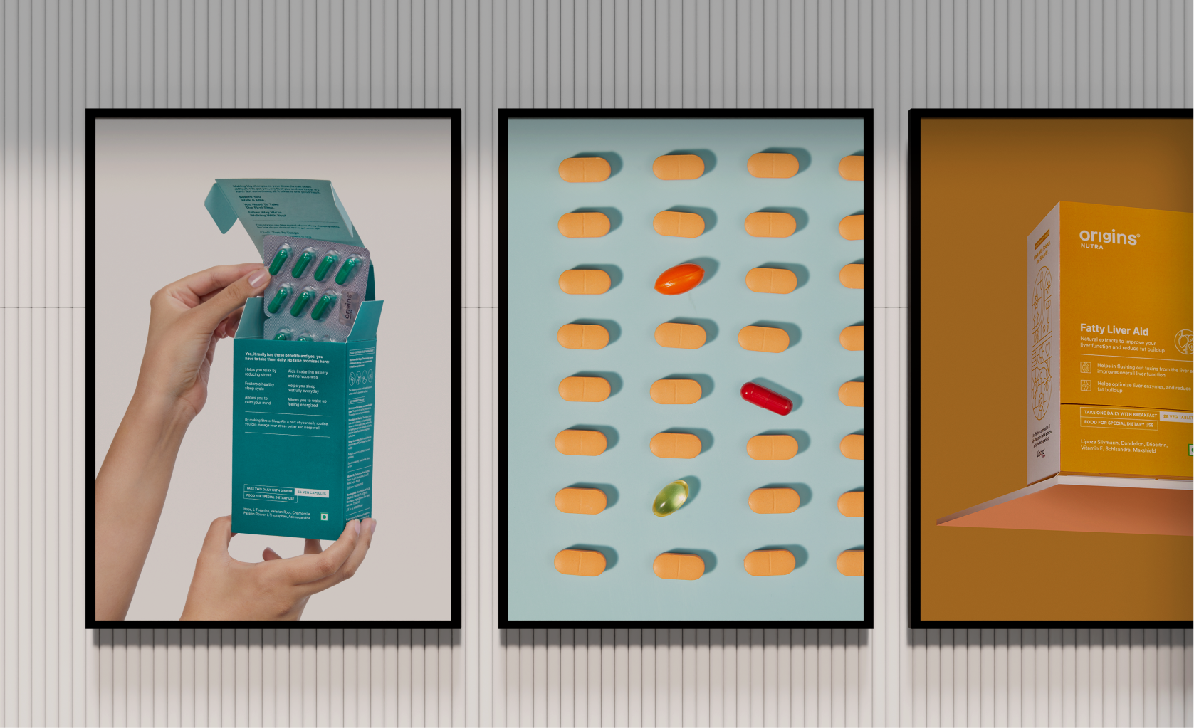
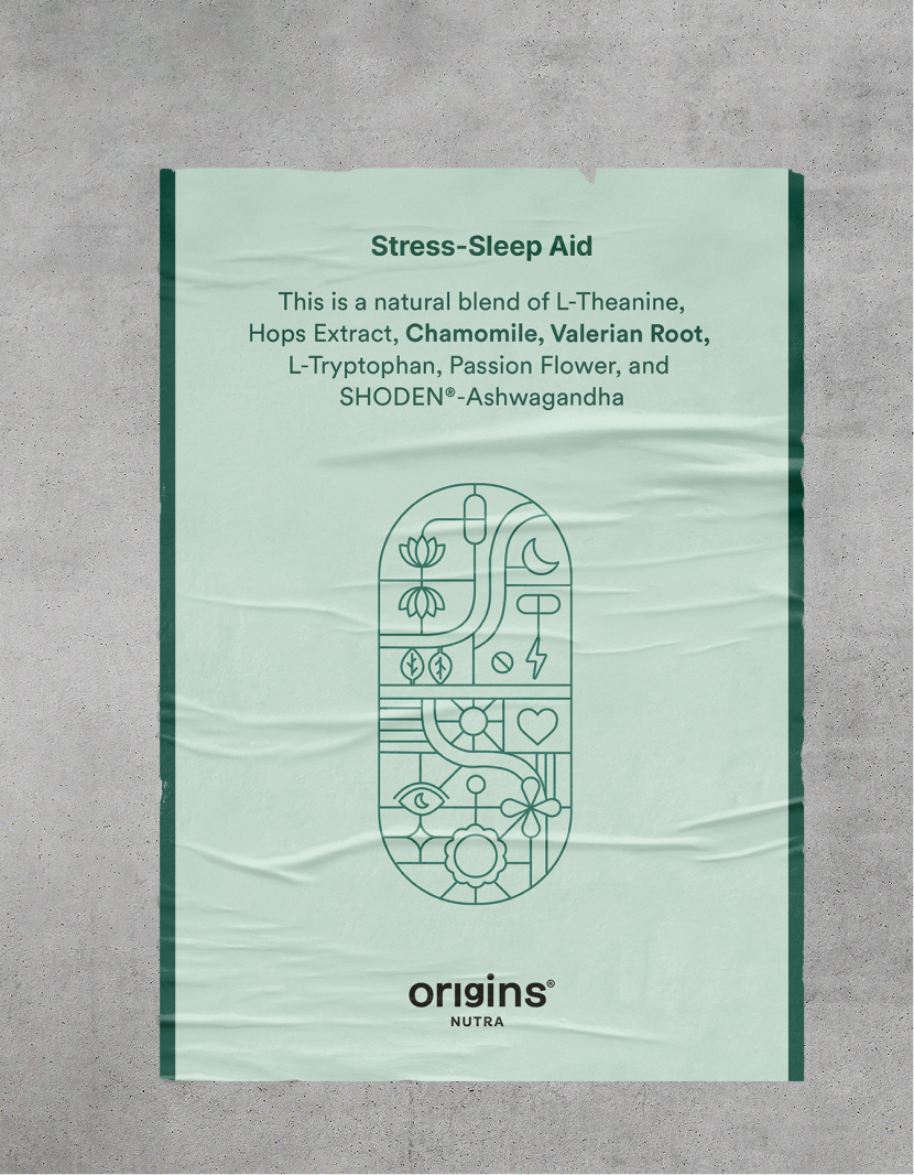
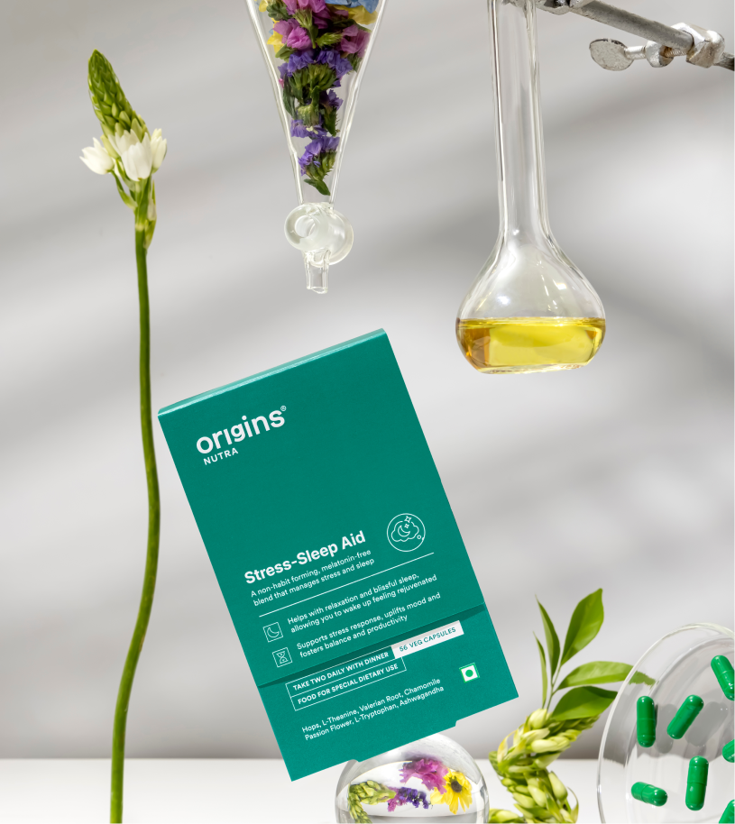
Each Illustration is a combination of benefits, ingredients, brand values and product details fit inside the shape of a pill.

This became the base of our visual language made our promise of being honest and transparent a lot stronger.

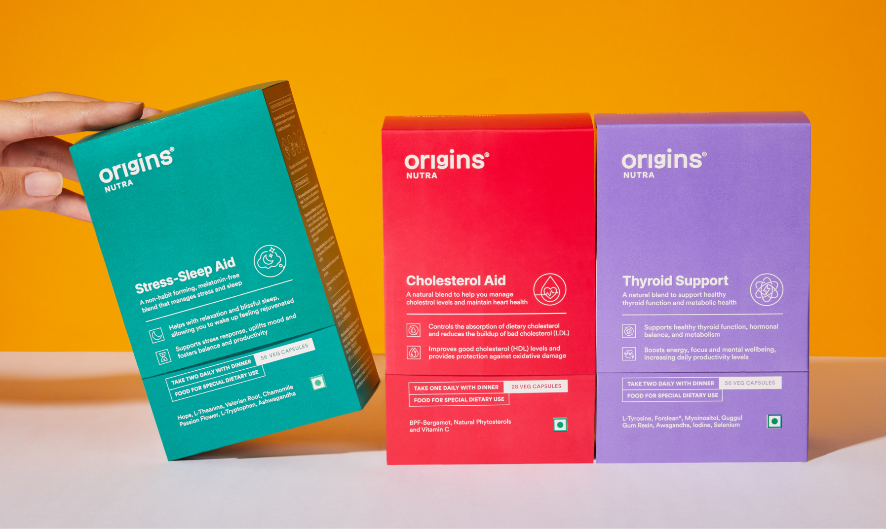
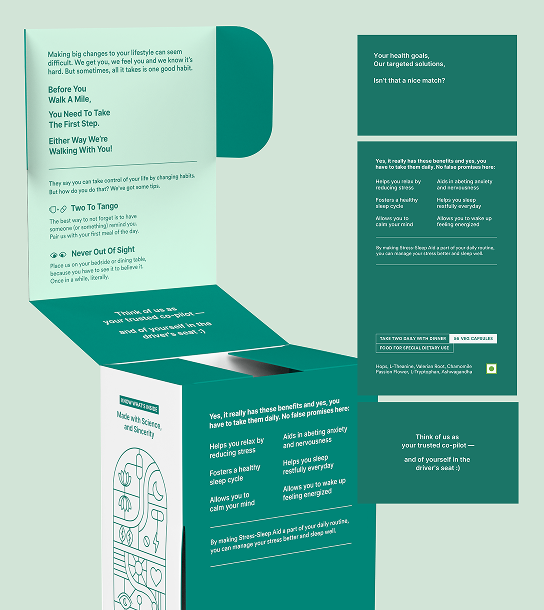
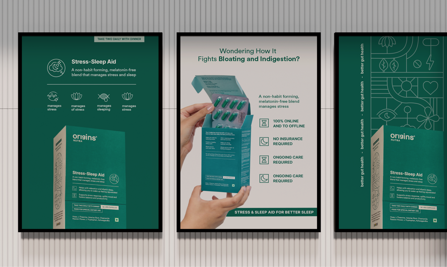
Starting is the hardest part, so we designed the box to do some of the coaching.

A new health routine is overwhelming, and most people quit before the first box is finished. So we built the coaching into the packaging instead of leaving it to the label.

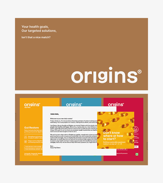
The products arrive in a brown corrugated box that opens to a founder’s note and a short brochure on how to begin. Both set expectations before the first capsule.

Habit formation is what makes the difference. Why consistency matters, what makes it easier, and clearly stated benefits so you know what to expect and roughly when.

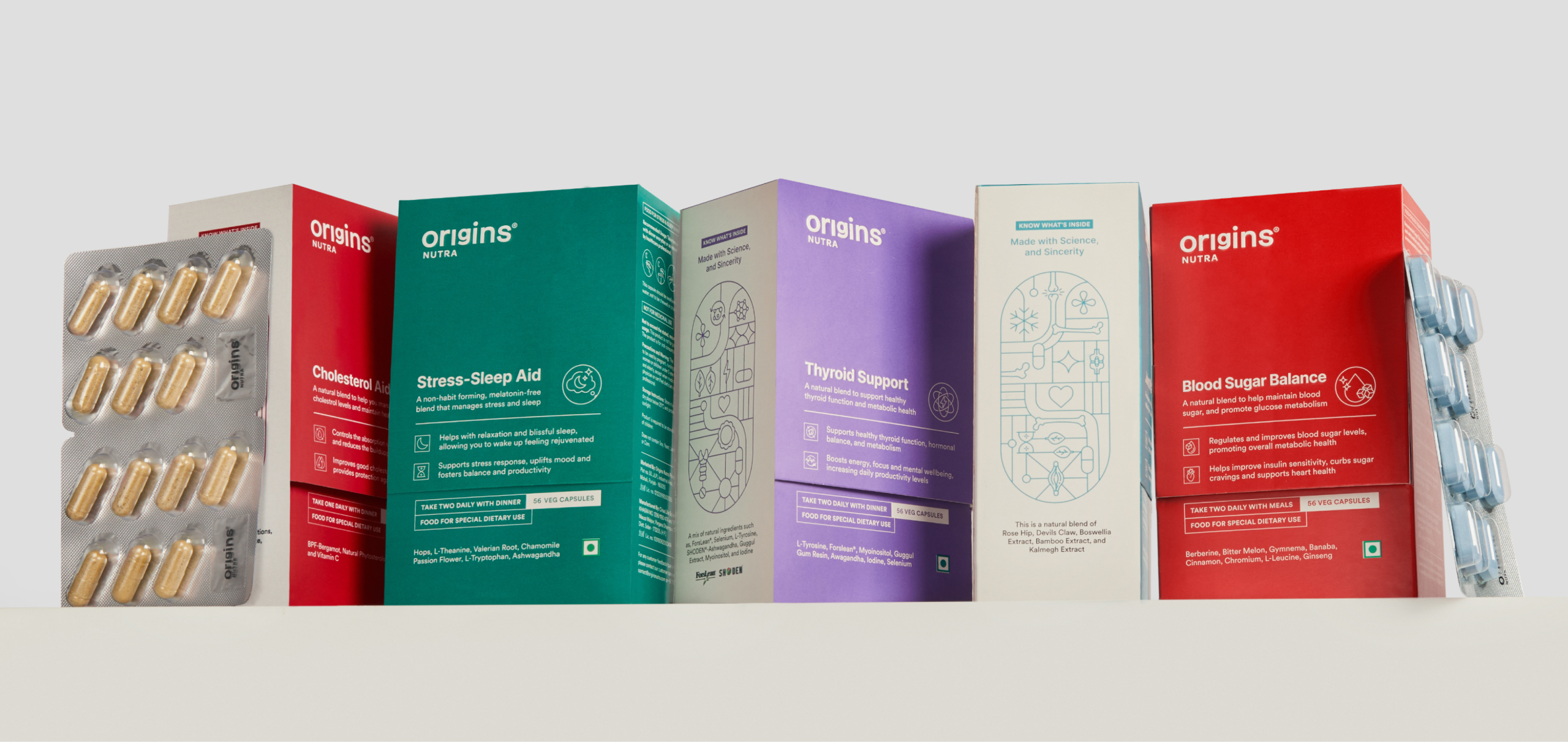
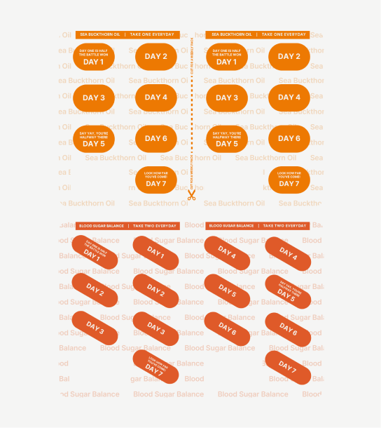
The pill strip stays with the consumer longer than anything else. Divided by day, with an affirmation on each, colour coded and named so the right strip is findable without reading it twice.

How do you build a website that delivers experience?

We designed the website just like a brick-and-mortar store.

Once you walk in the Origins store, it’s important to understand not just the product but a lot of other things

We addressed each and every question that you might have through your journey. It is crucial you understand everything before you make the right decision.

A Space & Legacy Reimagined

Meet Better Personal Care

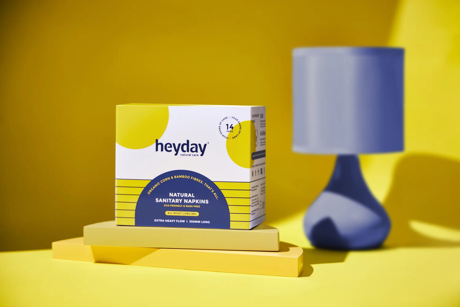
Heyday: Your Share Of Care

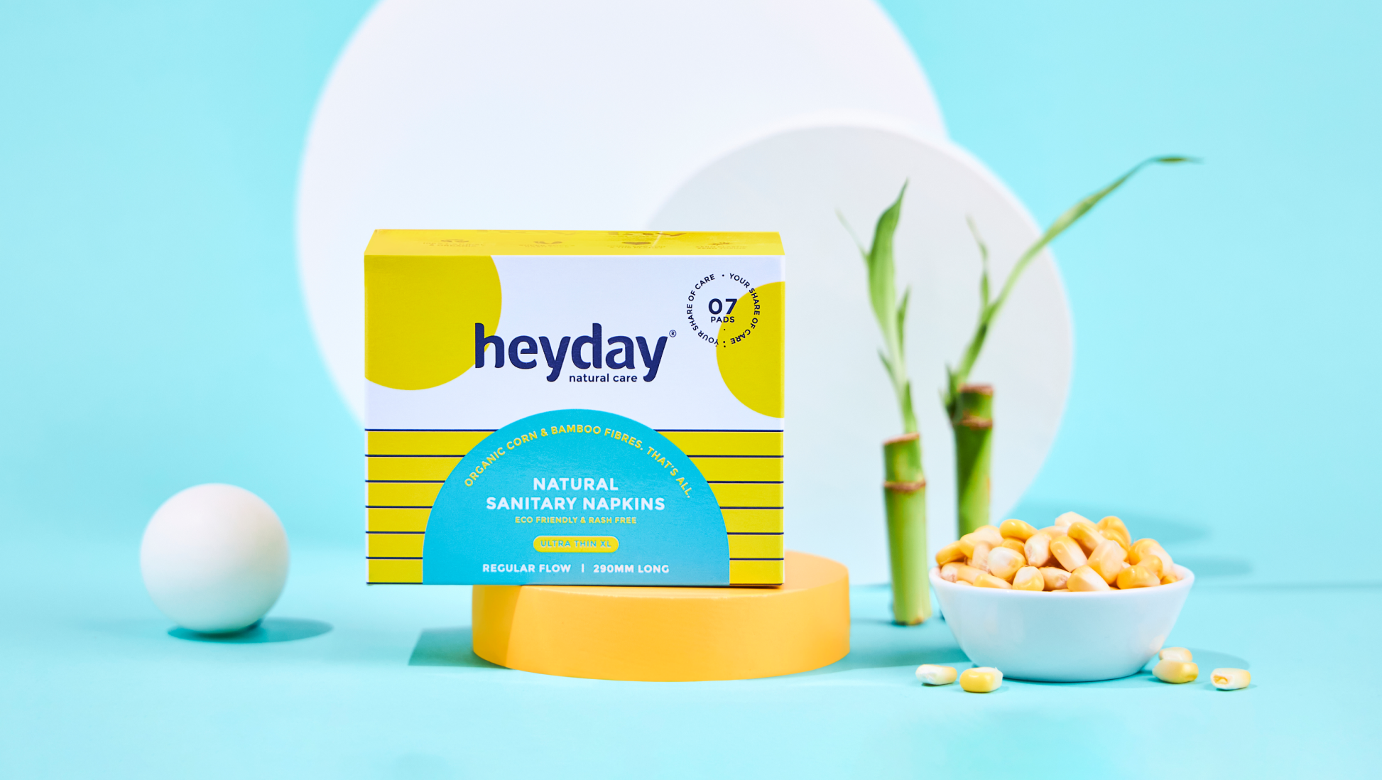
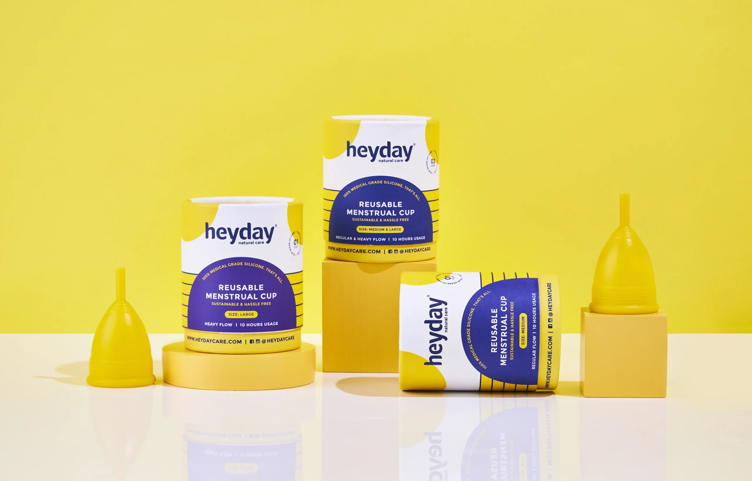
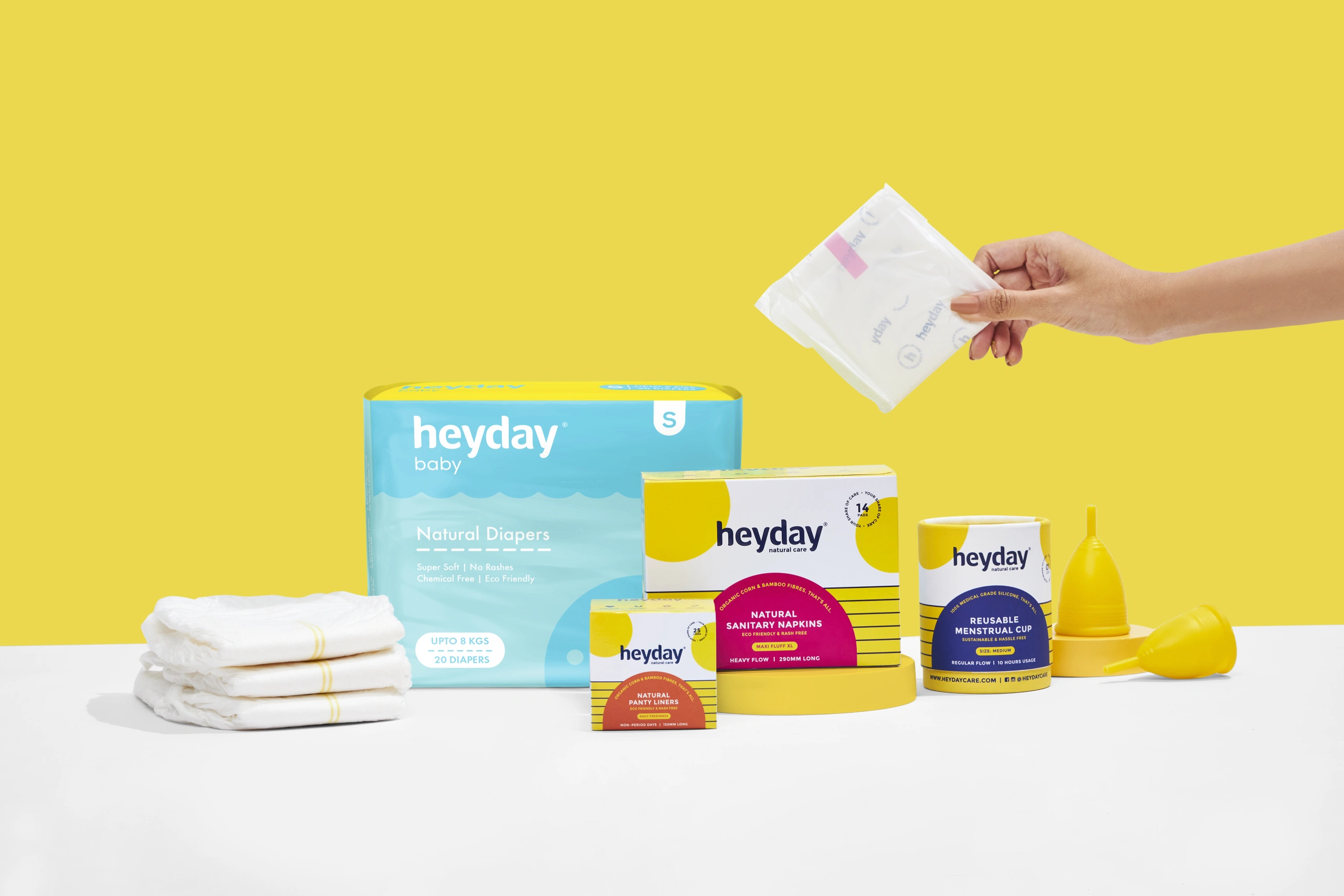
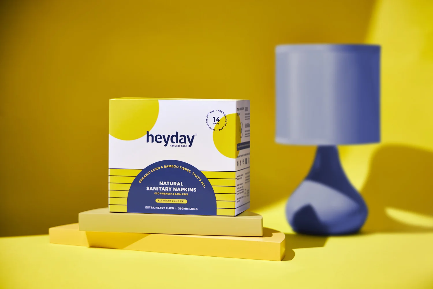
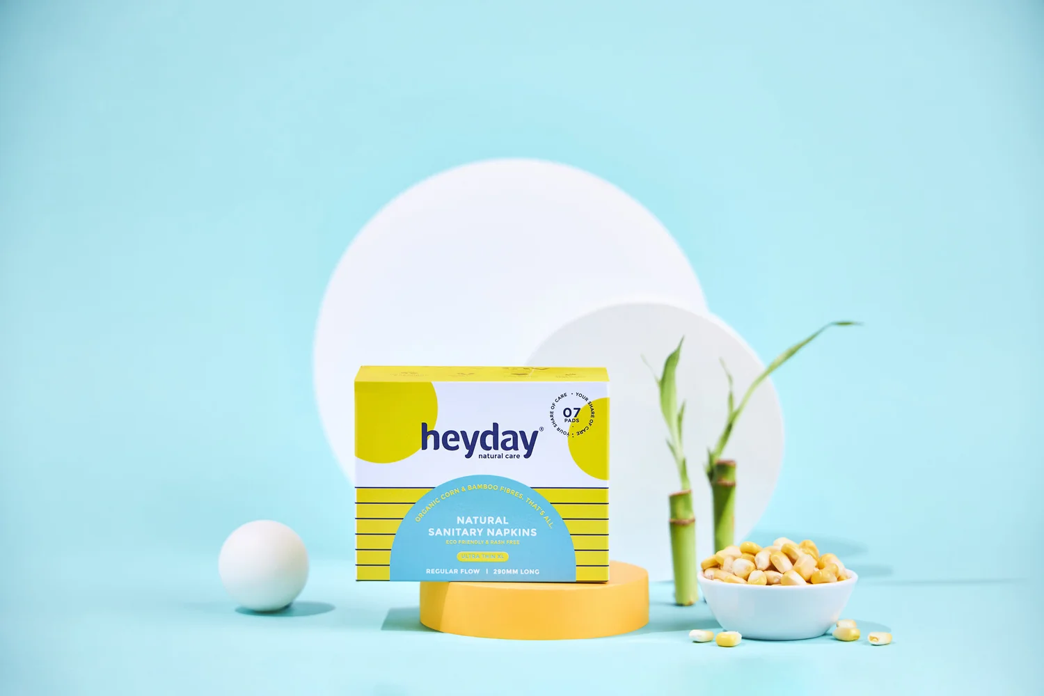
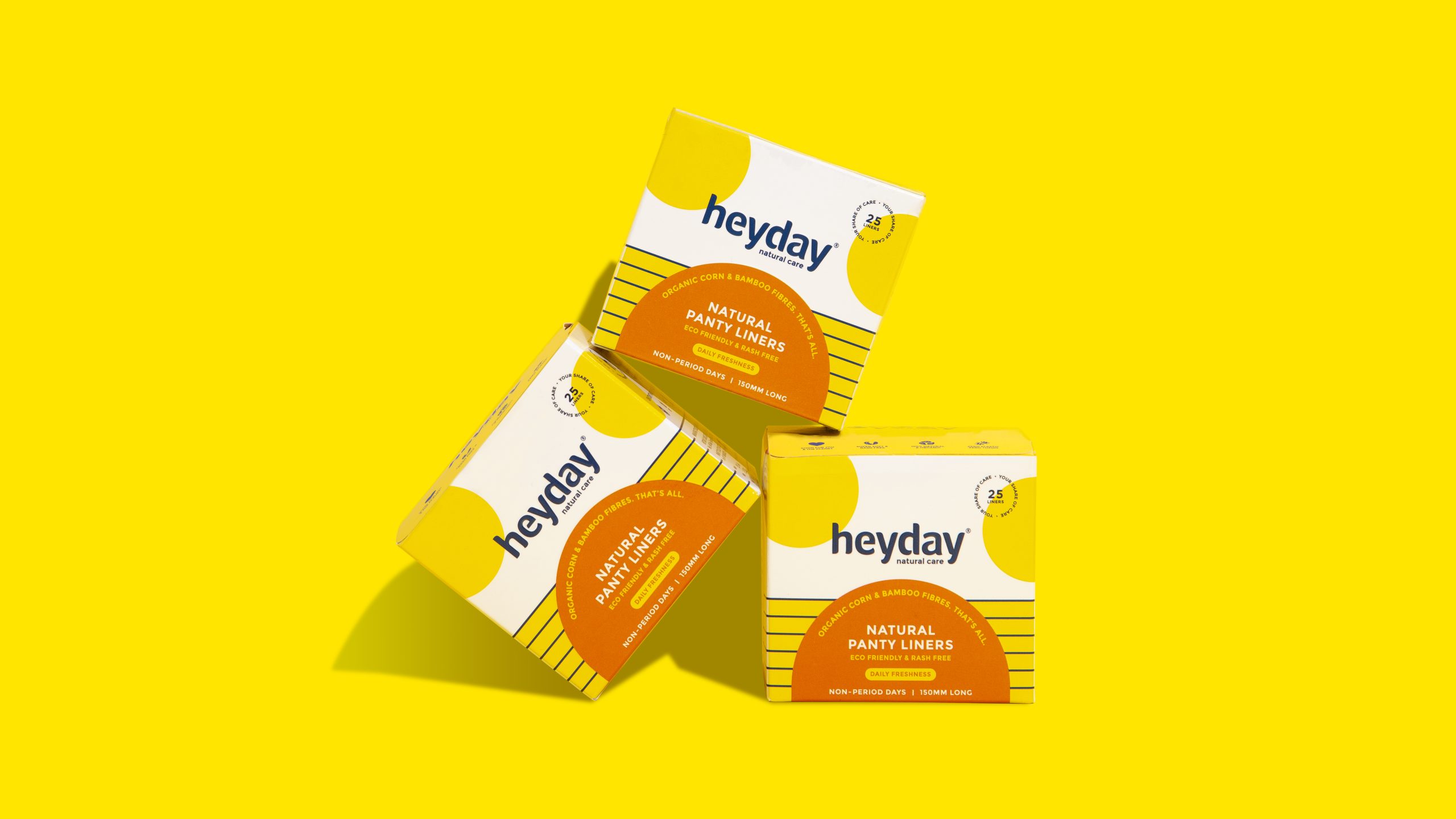
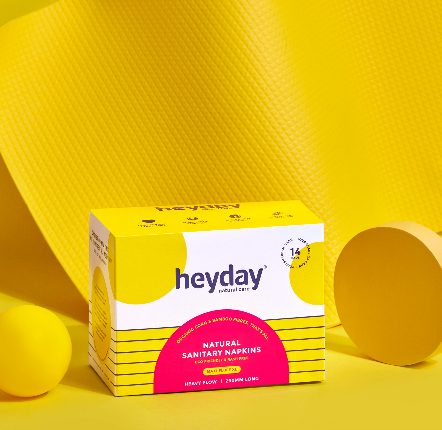
Heyday is India’s first natural personal care brand, making 100% natural and organic hygiene products for women and babies. Founded by Deepanjali Kanoria, the brand is built on a simple belief: the products we use every day should care for the two homes we all live in, our bodies and our planet.

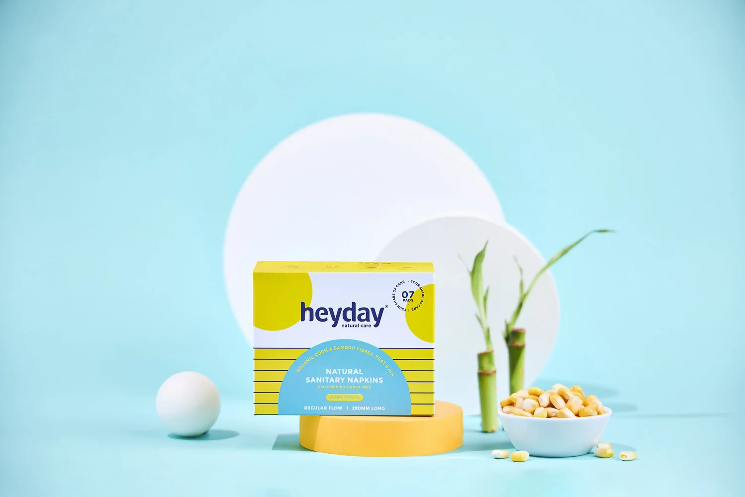
Heyday came to us with something rare, a brand people already trusted, and something common, packaging and language that weren’t telling the whole story. The ask was to renew the brand language, refresh the visual identity, and repackage the entire product range, so that what made Heyday genuinely different was visible on every shelf.

The work spanned research, strategy, identity, packaging, visual extension, art direction and web design. And like every project at the studio, it began with a question.

Most brands claim to have natural products. How was Heyday different? How can we show consumers what is really good for them, without sounding preachy?

On researching, we found that despite how highly saturated the personal care segment was,  consumers were still uninformed about body and planet hygiene. To bridge this gap, it was necessary to educate them on the importance of using clean products through Heyday’s brand language.
The research helped us identify the target audience to be those who were environmentally conscious, aware of the choices they made for their body and were willing to go the extra mile to buy 100% natural products.
We realised that we could also only talk about feminine hygiene if we bust the stigma around menstruation since sanitary napkins were the brand’s first product. So it was important for the brand to be approachable and smart, while also staying fun and informative.